

It's been a little while since my last post, but there is
just so much going on in the world that it is hard to gain clarity through all
the noise. There have been some incredibly positive developments in 2021, like
the vaccine roll out and the slowdown in the pandemic here in the United
States. However, we cannot ignore that a lot of chaos and strife has popped up
all over the global community…and now inflation is potentially showing its ugly
head! It's very hard to even keep track of it all, much less try to quantify
what it all means. Since my last post, "Barbarians at the Gate," was so well
received, and inflation is something I think I can get my mind around, I
thought I would dive into that, thus, my title: Money Talks.
By now you know that I like to consider the equation of exchange.
Many economists consider this to be the fundamental formula when
trying to understand the incredibly complex forces at work in an advanced
economy. I want to cover the variables in the formula in some depth today,
because as investors we need to understand the major forces at work, not merely
react to short-term price signals that emerge downstream. Please understand
that I do not claim to have the answers to all of the questions we need to be
asking—no one does—but that does not exempt me from examining those facts on
the ground that I actually can see.
I want to cover the variables in the formula in some depth today, because as investors we need to understand the major forces at work, not merely react to short-term price signals that emerge downstream.
As a reminder, the equation of exchange formula is M x V = P
x Q where M is the money supply, V is the velocity at which money is spent, P is
prices, and Q is the output of the economy. Why is this formula true? Well, if
we multiply the money supply times the velocity at which that money is spent it
should equal the nominal GDP of a country. Likewise, if we multiply prices by
the quantity of products produced and sold, we will also arrive at nominal GDP.
So, the two sides are equal to each other. Now, the real tricky part of this
whole situation is correctly getting the actual inputs for variables.
Thankfully, I can rely on the St. Louis Fed for consistent (and hopefully
accurate!) measures of these items. For example, we all know that the money
supply has absolutely exploded over the last year or so, but is this growth
notably different from the long-term trend?
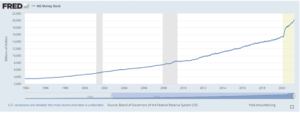
Yes!
If talk of the money supply has bored you in the past, this
graph should be a wake-up call. As noted above though, it also really matters
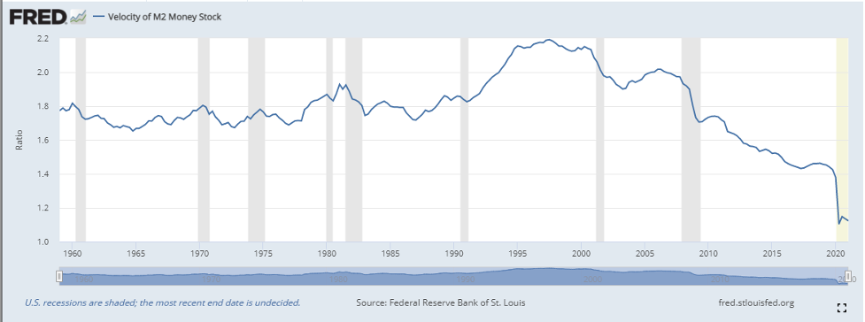
how quickly people are spending this newfound mountain of cash (V = velocity),
and it turns out (as depository institutions know!) that they really aren't
spending very quickly. What is happening with it? I think the best way to view
this is through what the Fed calls the personal savings rate, which reflects
the percentage of people's disposable income that they save (in other words,
don't spend). Over the last 50 years, the "normal" savings rate hovered just
below 10%. Only once in that 50-year
period did it ever go above 15% and that was in 1975, when Richard Nixon had
just been impeached and the U.S. was coming out of a major recession—it reached
17.3% that year. At another extreme, it dropped to a low of 2.2% in 2005, thus
giving us a 50-year range of 2.2%-17.3%.
Today, it stands at 27.6%! Of course, there are tons of reasons for this. During this past year, people have not been spending on vacations, going out to eat, heading to the mall, etc. I get it, you get it, but the reality is that this has help to push the velocity of money way down. Not surprisingly, we are at the all-time lows for this figure. Here is a graph of V over the last 50 years; the current situation historically remarkable.
So, it might appear that the two variables on the left side
of our equation, M and V, are kind of offsetting each other. Money supply is much
higher while velocity is much lower. As I noted above, these are really complex
systems, so now let's take a peek at what we know about the right side of the
equation: P x Q. I spent a fair amount of time in my last post talking about
the prices of goods that have been rising rapidly. Everything from lumber to
oil to groceries to housing. We have seen gasoline prices go up over 50% in
just the last 4 months, and they will likely go higher. Every economist I read,
hear, or watch is talking about the inflationary forces at work. Our latest
real data point came out on May 12th, 2021, when the year-over-year
consumer price index (CPI) number was reported at 4.2%—well above expectations.
The Producer Price Index (PPI) came out on May 13th, 2021, and
surprised to the upside as well. Prices are running hot; we can all see that.
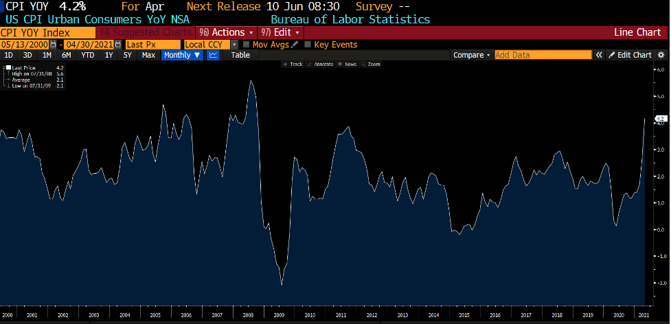
I can't imagine I would get too much pushback from people if
I said it looks like our P is rising and may continue for some time. Inflation
is coming home to roost.
So, what does that mean for the ever-important Q?
Well, if the money supply and velocity portion of the
formula continue to offset each other, combined with rising prices, the only
way the equation remains in balance is for economic output (Q) to decline. The
truth of the matter is that GDP took a massive hit in 2020 and did in fact drop
like the proverbial rock. We then had a big spike in the 4th quarter,
followed by another scary drop. I think we have to say that Q is still in flux
and needs some time to smooth its way out of last year and settle on its
"steady" value. It will be bumpy. We can see that there are strange things
happening in the labor force. There is definitely a disincentive for people in
the hourly wage category to go back to work as long as they can receive more
money by staying on unemployment insurance. Likewise, not having kids go to
school every day in large portions of the country has made it harder for some
families to have two parents return to the workplace.
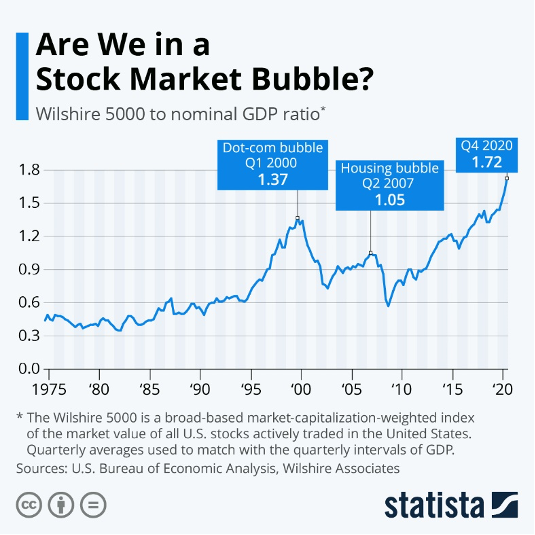
Something has got to give. Imbalances can and do happen, sometimes
for a good while, but they eventually they always correct. We have seen this
time and time again, most recently in the housing crisis of 2008. This Statista
graphic really caught my eye. It asks a question that I ask myself everyday as
I watch the stock market keep going up. It also happens to fall in line with my
premise that something has to give. If the Wilshire 5000 it is displaying is a
representation, more or less, of "Q," then this graph is portentous. Maybe it
will be the stock market that "gives." Maybe it will be a SPAC implosion. Maybe
it will be commercial real estate. All I know is that eventually—it will be
something.
As I have said time and time again, we do not know what the
future will bring. I just see lots of wild things going on in that equation of
exchange. Only time will tell, but we must remain vigilant.
Final, final thought: Really good nachos are rare, but when
you find them, diet trouble ensues.
Be sure to fill out the form below to subscribe to my weekly blog.